Why the CC Logo Changes With the Bag Style
Why is the CC logo cut out or stenciled on the ornament of my 22 Hobo bag?

The iconic CC logo will always match the design, functionality, and story of the bag.
The logo’s design adapts to the specific bag’s style:
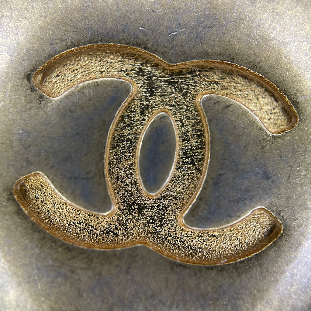
For the 22 Hobo bag, the design is meant to be industrial, casual, and modern, so the cutout CC logo gives the bag a modern, industrial look. The cutout or stenciled fonts are usually used for this specific purpose wherever you see them used.


-
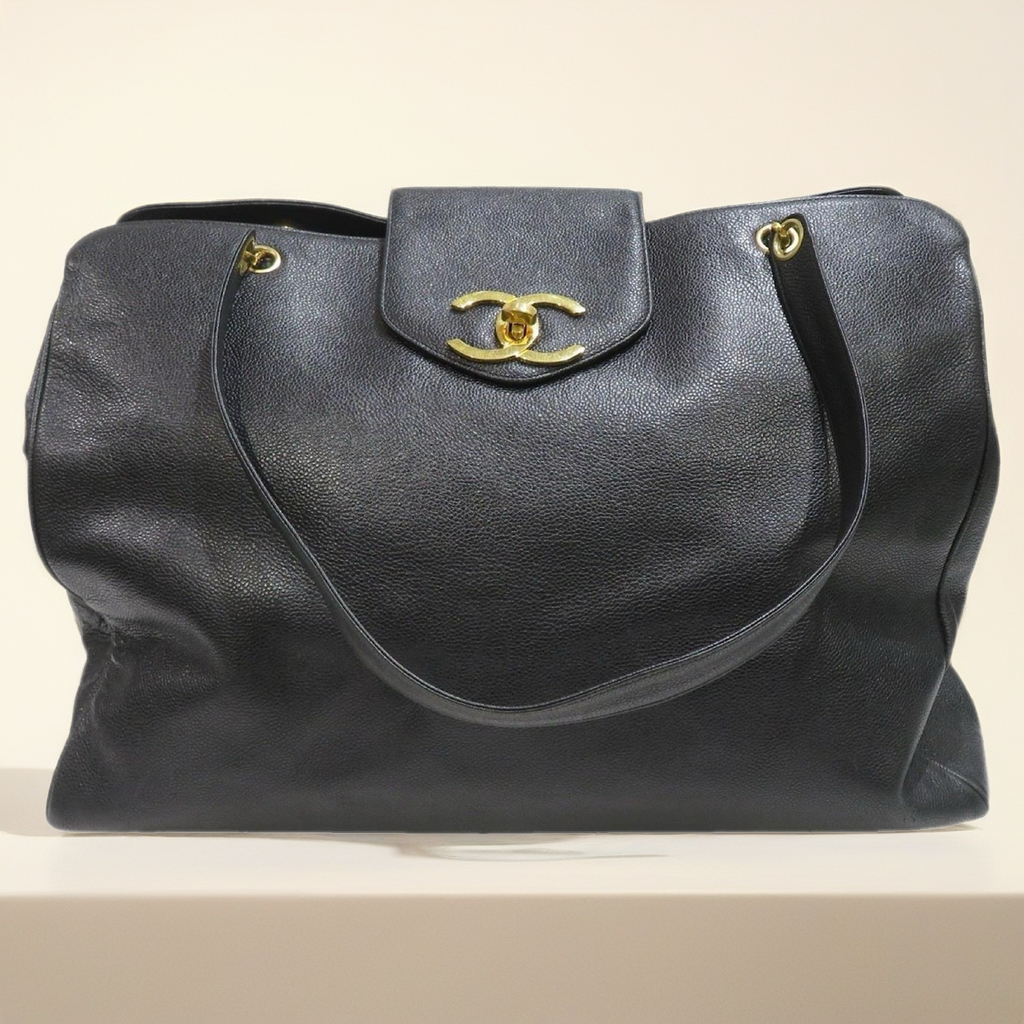
Timeless Classic (TCL/11.12):
Features the classic CC original logo, reflecting its classic original flap design. -
The Boy:
The bulky, manly CC logo on a square with no curves to minimize femininity is fitting the tribute to Boy Capel, Coco Chanel’s love. -
The 19:
Features a woven interlaced CC logo, combining elements of the classic flap and the 22 with hardware and interlaced CC, striking a balance between formal and casual as the fundamental functionality and appearance of the bag. -
The 2.55:
Designed without the CC logo, true to Coco Chanel’s original 2.55 design, as she did not use her logo on her designs until the 1970s. The original 2.55 featured no logos or lettering at all, so there was no CC embroidered on the inner flap and no CHANEL word on the clasp as the design now. She valued craftsmanship over flashy logos and it’s extremely rare to see pictures of the mademoiselle wearing anything with the CC logo, and she only wore her designs.


Written by Zekrayat Husein


Leave a comment
This site is protected by hCaptcha and the hCaptcha Privacy Policy and Terms of Service apply.